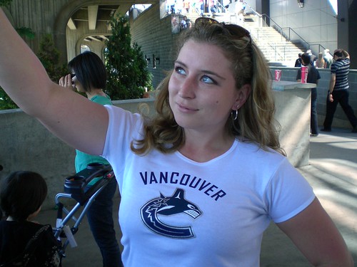
The New Canucks Logo
I attended the Vancouver Canucks Tailgate party and new uniform launch thingy at GM Place today.
It was nice to jump on the seabus and get out of the office for a bit. Of course they picked seemingly the hottest day of the summer so far to do it. There were a lot of people lined up to for free hot dogs and a chance to hang out with FIN the Canuck’s mascot before the big event.
I was able to hook up with Rebecca and Dave from The Crazy Canucks who helped me skip most of the big lineup and get to a good spot with JJ in the shade – he was thinking ahead and got there early.
They managed to record a podcast despite the huge crowds and noise. I even make a brief guest spot on the podcast too.
Once we got inside, we got pretty decent seats, albeit on the opposite side of the proceedings. To my surprise, the event started right on time at 12:30pm and they introduced a number of key members of the Canucks organization.
But we weren’t there for speeches, we were there to see the new uniforms and logo.
Pretty much as expected, they revealed the logo design that I had spotted in a Gastown store a few weeks ago. I was hoping for something a little different or a retro design so I’m basically indifferent to the new look. I do like the addition of “Vancouver” across the front but as Rebecca said, it does make it look a little busy.
Considering they had well over 8000 people come out on a sunny day during the summer, you still couldn’t even buy a new jersey onsite. They were only selling t-shirts and taking preorders on the jerseys. Talk about a lost opportunity to sell a ton to some of the most passionate fans….although it’s not like those people won’t still buy it all up like Rebecca did:
More pictures from the event in my photo section. Rebecca and John already have more in depth coverage on their sites. My friend Dave (who wasn’t able to attend) has posted his thoughts on the new look as well.
UPDATE: The Crazy Canucks podcast that was recorded during this event is now online! You can listen to it right on the site or download the mp3 for your favorite playback device. I start mumbling around the 3:20 mark.


I don’t understand. Isn’t this the same logo they had a few years ago? Please enlighten me.
Yup…it’s pretty much the same…they just washed out the other colours from it and made it basically a wash of blue on the black outline. They are adding a retro stick logo patch to the shoulder of the jersey though.
Someone told me they were making people sign waivers or something before they could go into GM Place. That can’t be right, could it? Not if 8000 people were there. Thanks for the post – I heard about it too late and the event was sold out. I think the “new” logo is pretty “meh” myself.
I didn’t sign a waiver and didn’t see anyone else doing so….it was pretty chaotic and I think having people sign something before they went in would have pretty silly. Perhaps some of the VIP’s had to sign something but certainly not the masses.
I thought the event was sold out too but a coworker checked the Ticketmaster site last week and we were able to get tickets…I didn’t even think to try since I had heard it was sold out…good thing he tried.
It was an interesting event but I probably won’t go out of my way for it again (presumably when they come out with the third jersey)….I do wish I had brought my zoom lens though…could have had much better shots.
A waiver? What for? Once the jerseys were presented, they were going to be public domain in a matter of minutes as it was… I’m also a little shocked that one couldn’t pick up a new jersey onsite. I guess fear of the logo leaking trumped a fantastic marketing drive.
The colours and the stripes are great. However, the corporate orca, the Vancouver wording, and the cartoonish stick and rink logos have to go, period. Orcas do represent the West Coast, but the name of our team is Canucks. That means having the classic stick and rink logo on the front, or even better, the Johnny Canuck lumberjack. That’s what our team named after and the city of Vancouver was built on the lumber industry. Why settle for second best when the logos aren’t even third best?